Designing a premium portfolio: typography, color and motion
Why this website uses a bold sans-serif with an italic serif accent, a warm cream palette and small, purposeful animations.

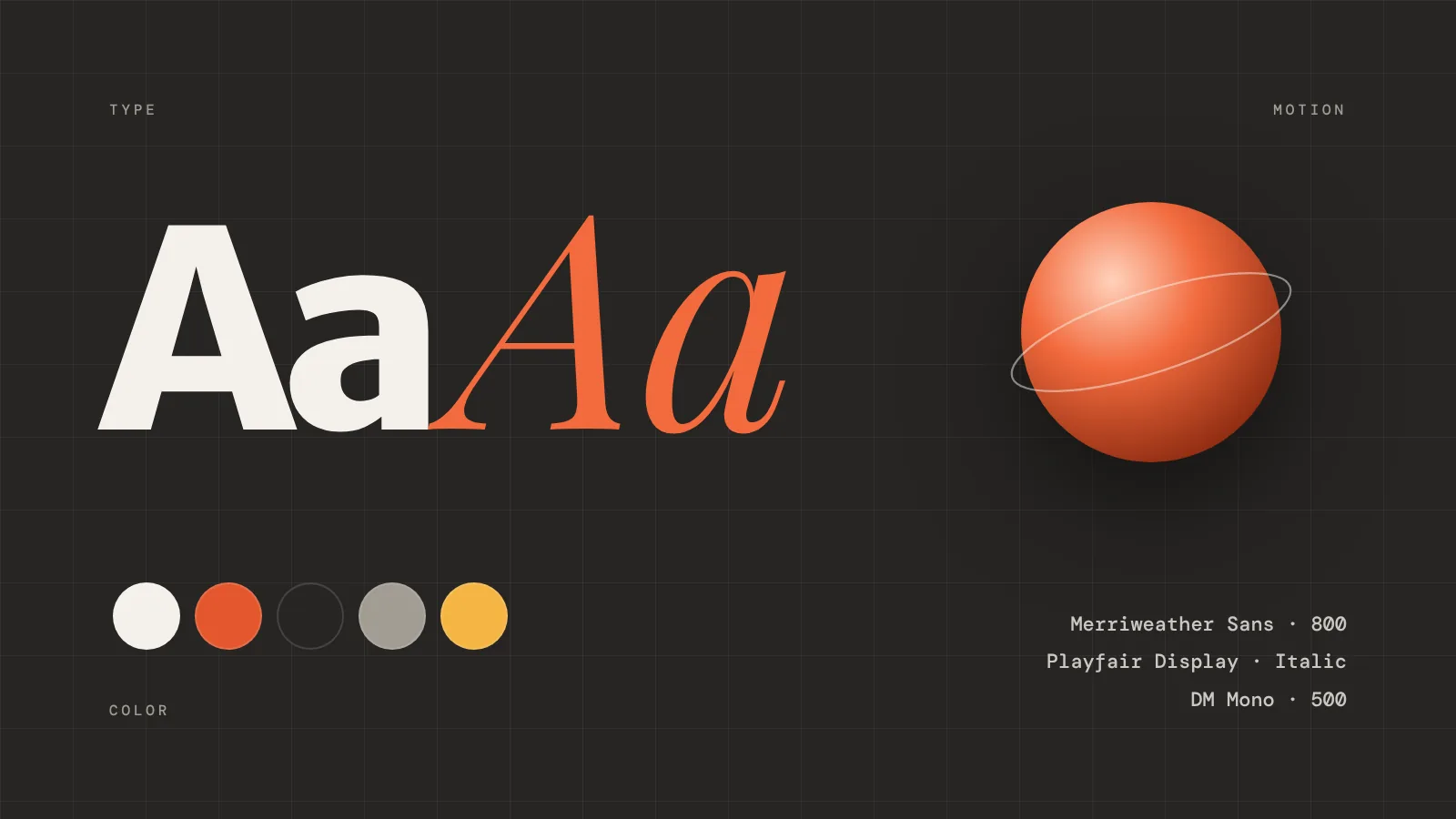
A portfolio has one job: make people trust you within a few seconds. Good typography and calm colors do most of that work.
Two fonts, two voices
A heavy sans-serif carries the headlines; an italic serif adds a human, editorial accent to one or two words. A monospace font handles the small labels.
:root {
  --f-head: 'Merriweather Sans', sans-serif;
  --f-accent: 'Playfair Display', serif;
  --f-mono: 'DM Mono', monospace;
  --bg: #F4F1EB;
  --accent: #E4572E;
}
A warm, quiet palette
Cream instead of pure white, near-black instead of black, and a single orange accent used sparingly. Everything else steps back so the work can shine.
Motion with a purpose
Sections fade in as you scroll, buttons respond to the cursor and the logo carousel moves slowly. Nothing jumps, nothing distracts.
Comments
0 commentsNo comments yet — be the first to share your thoughts.
Keep reading
More articles

Before & after: editing a sunset photo with my free Lightroom presets
Drag the slider to compare the flat RAW file with the final edit — then download the presets and try them on your own photos.
Choun Mia
How I secure a WordPress website — a practical checklist
The exact hardening steps I use on client sites: updates, a firewall, two-factor logins, backups and the server settings most people forget.
Choun Mia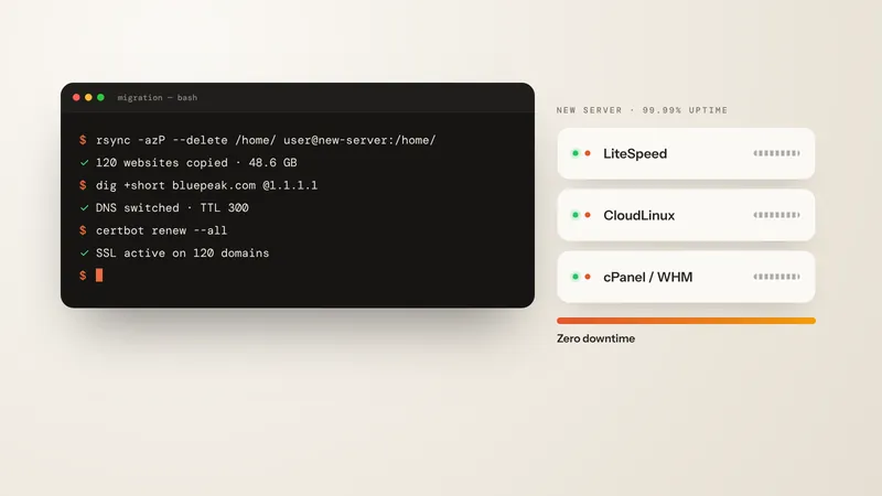
Moving 120 websites to a new server with zero downtime
My step-by-step migration plan — lowering the DNS TTL, syncing files with rsync, switching DNS and checking email, SSL and speed.
Choun Mia